Arkethane Concept

Contrast Kitchen

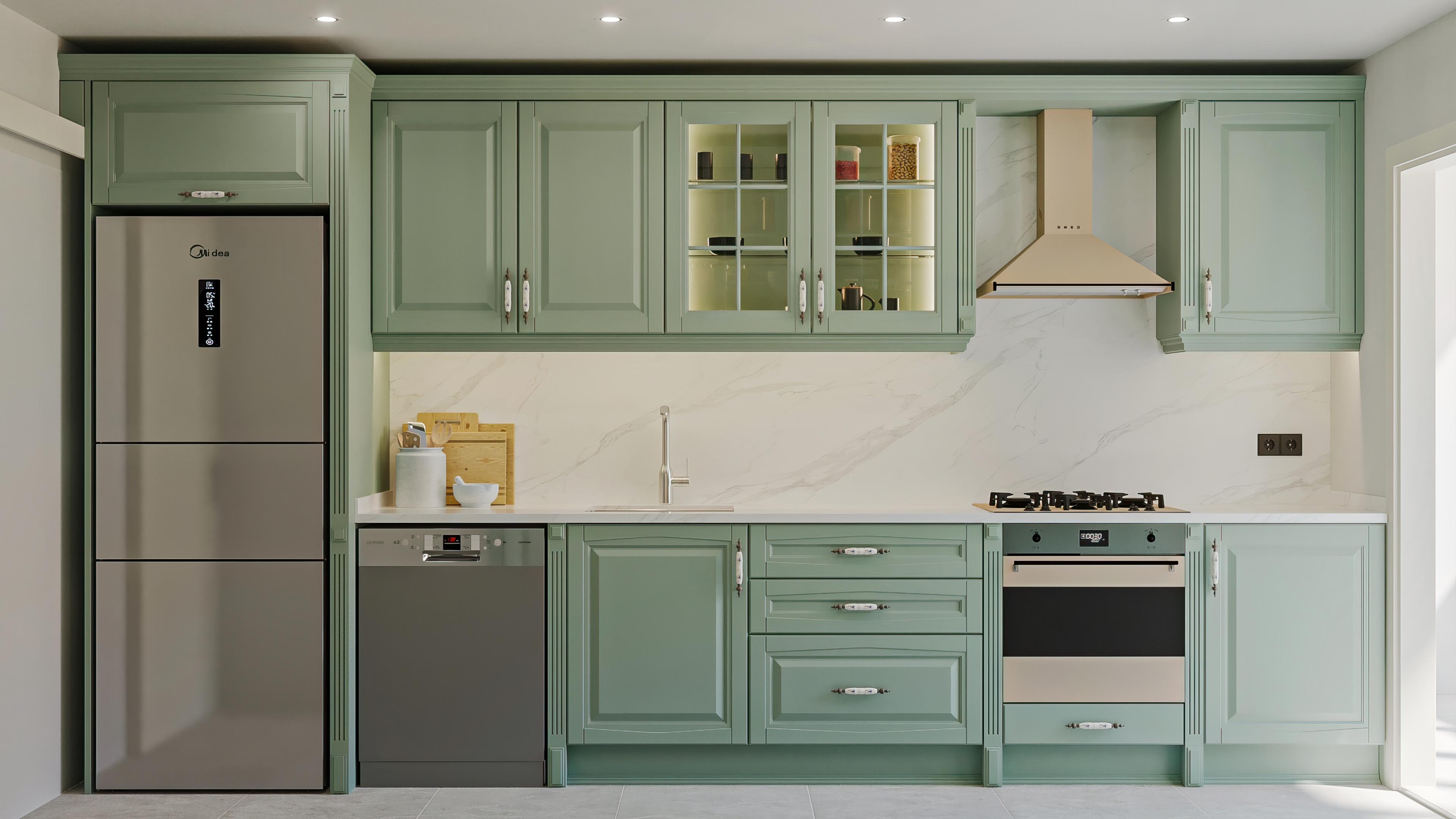
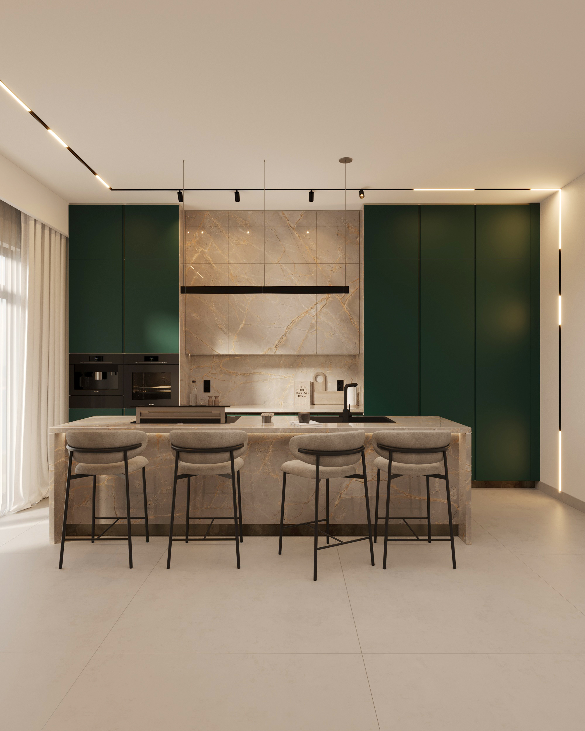
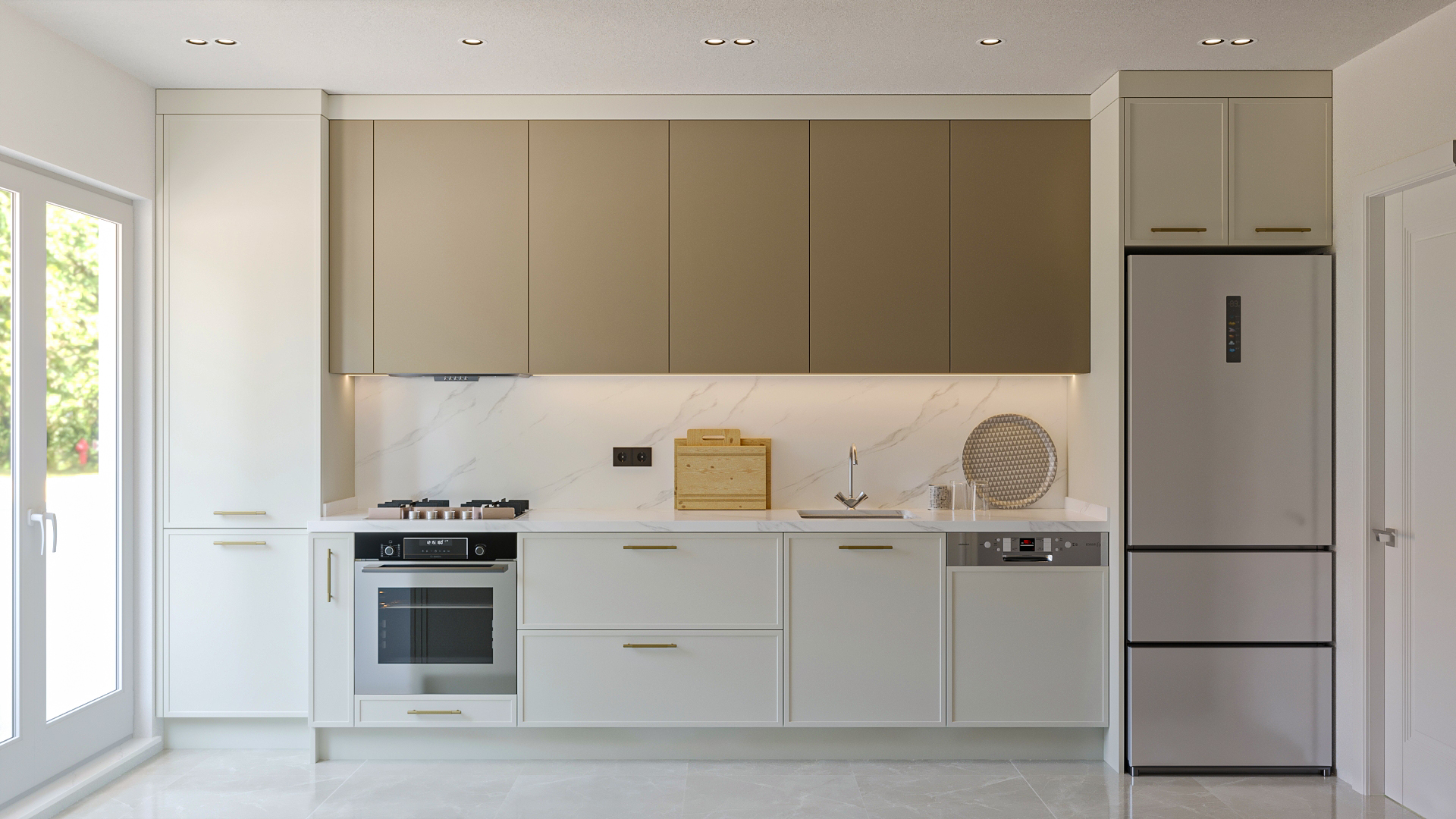
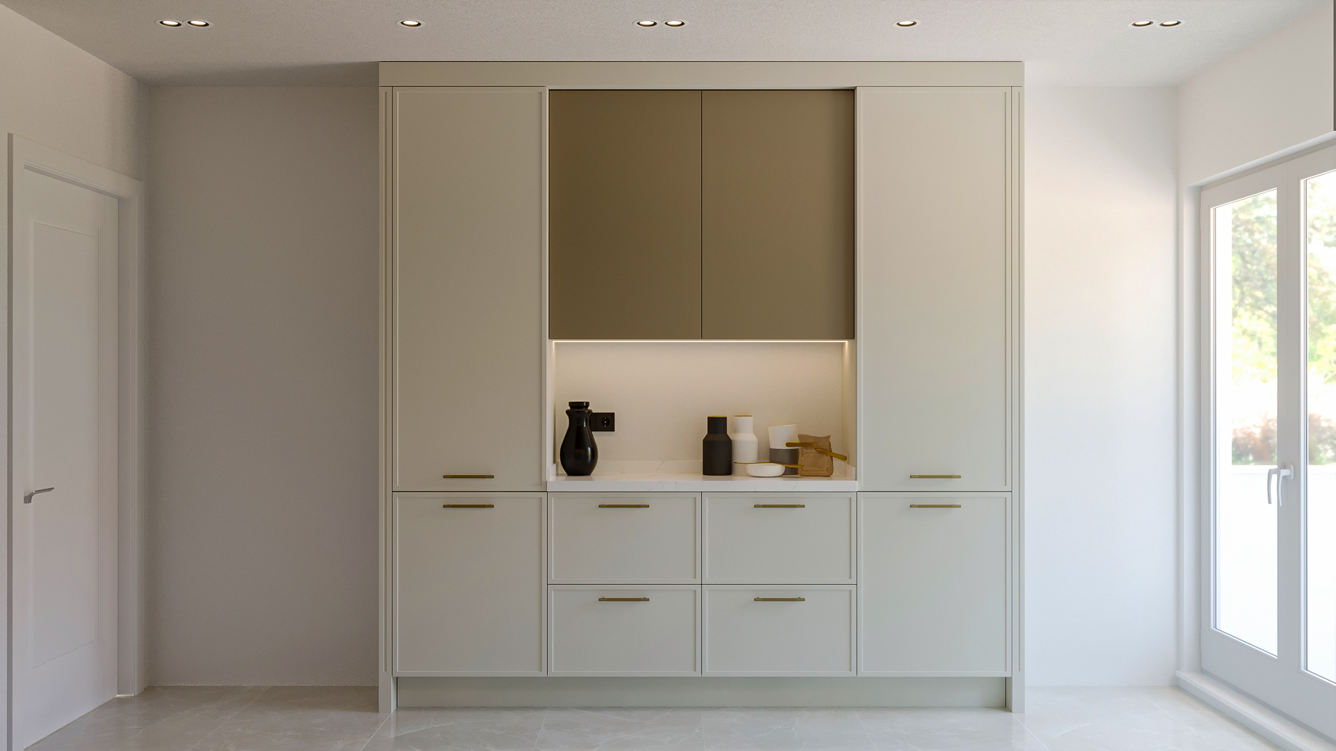
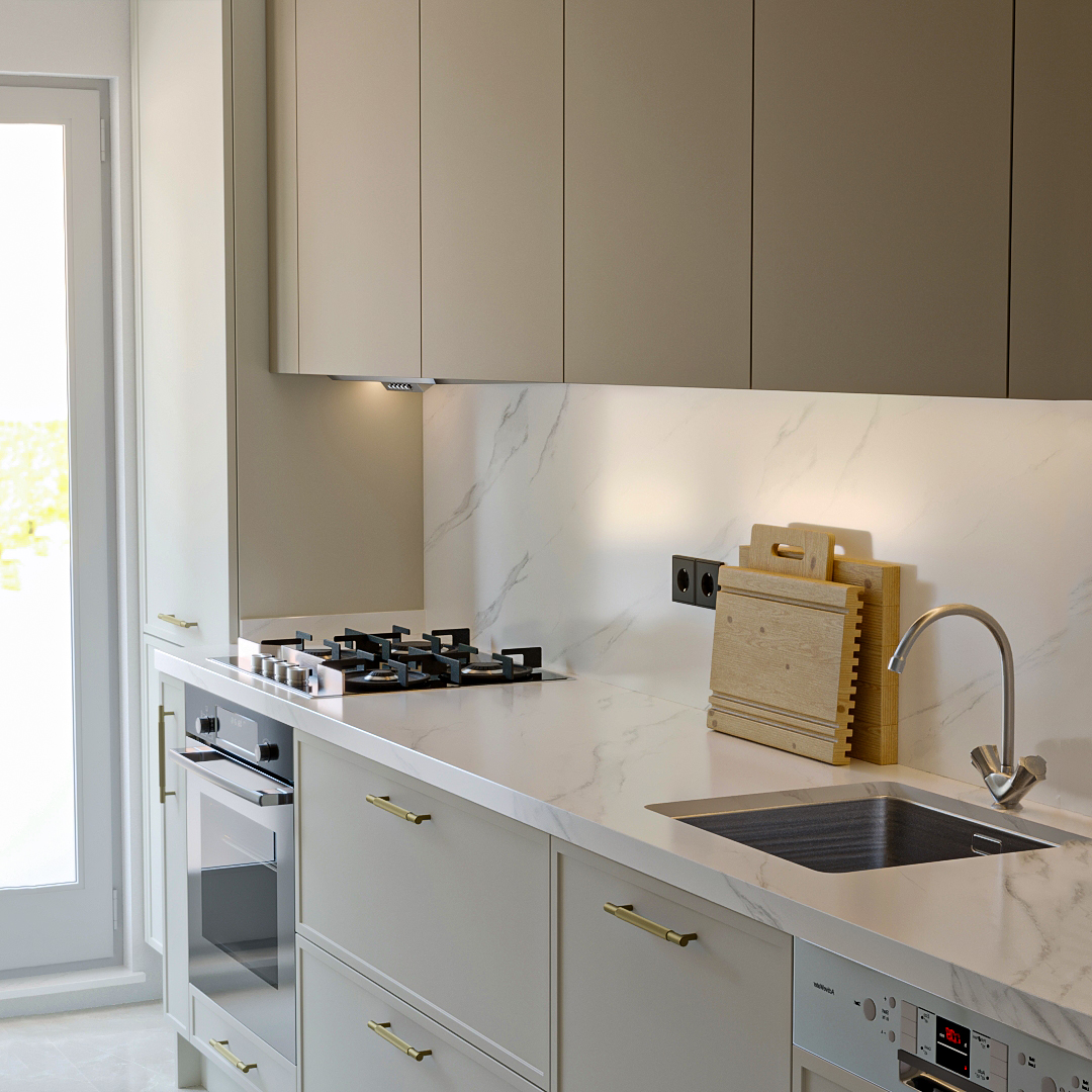
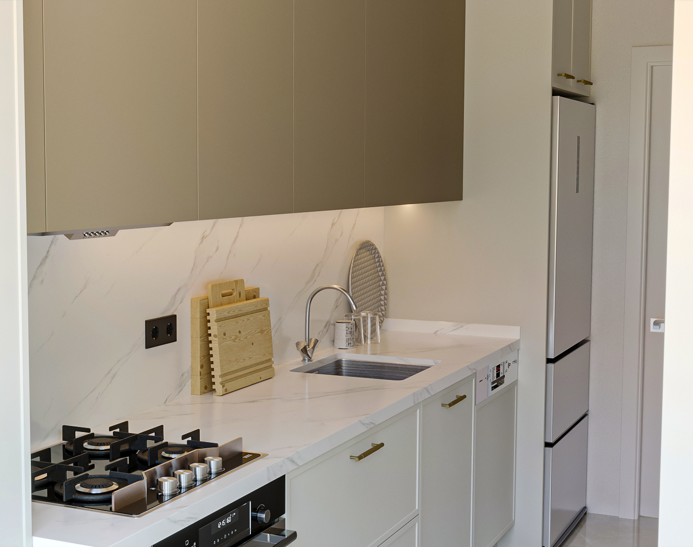
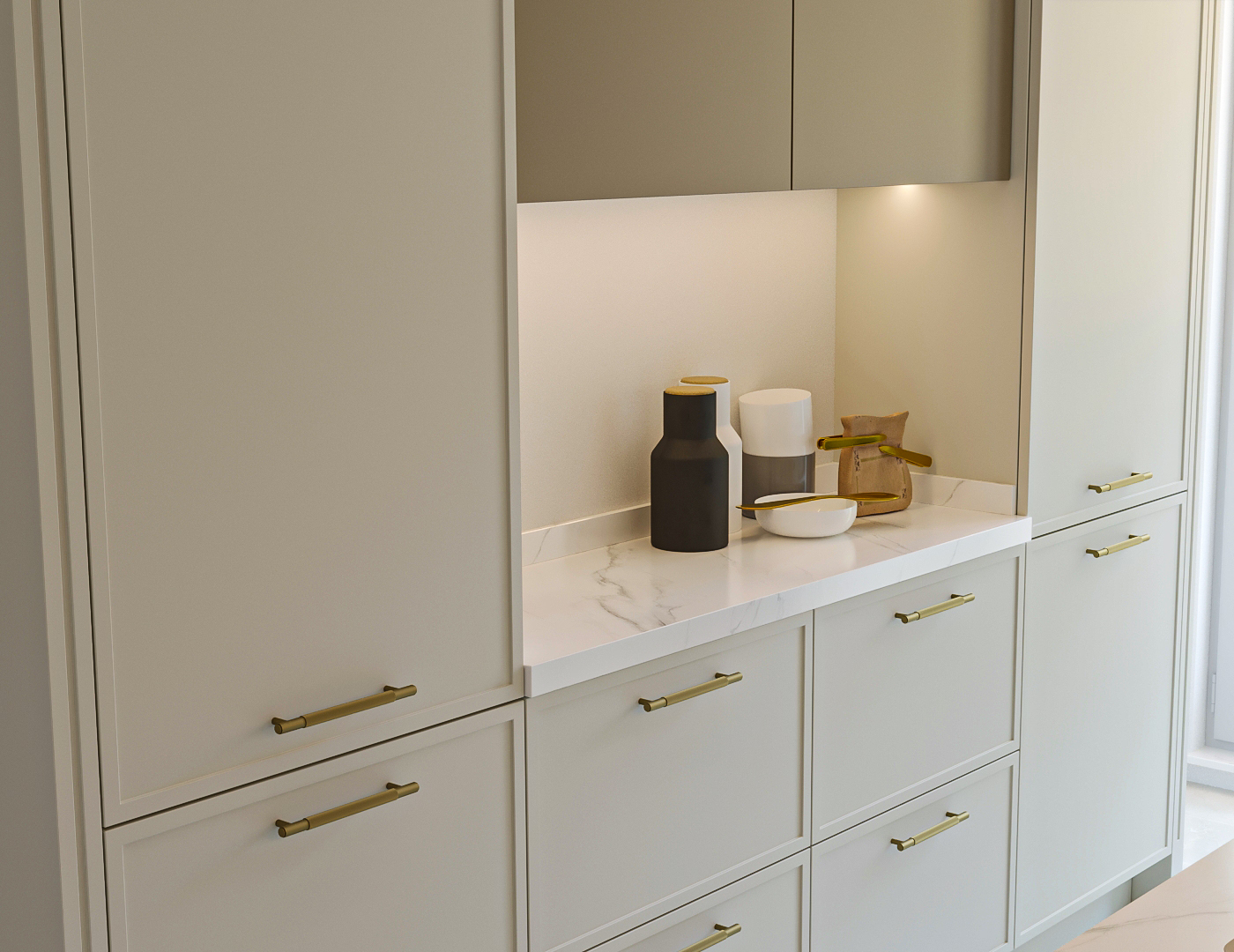
Contrast Kitchen is a contemporary design approach that combines the modern clarity of glossy lacquer surfaces with dark–light color contrast. With the balance between material, color, surface, and light, it strengthens both visual rhythm and functionality, offering a solid harmony between aesthetics and performance of use.

Contrast Kitchen is a contemporary design experience that brings together glossy lacquer surfaces and the strong opposition of dark and light colors. The contrast relationship balanced with a quartz countertop and clean surfaces creates a spacious, dynamic, and aesthetically sophisticated kitchen environment.
Project Details

Design Decisions That Transform the Space

Design decisions that transform the space

Contrast Kitchen is a kitchen design that creates a strong visual impact between colors and surfaces in modern interior architecture. The clarity of glossy lacquer surfaces and the balanced opposition of dark and light tones turn this project into not only a functional space but also an aesthetic and rhythmic composition.

Design Philosophy

Contrast in the kitchen is not only about colors; together with form, material, and light, it defines the character of the space.
In this kitchen, contrast is created through the following aspects:

  • The opposition between light and dark tones
  • The reflection of light on the glossy lacquer surface
  • Chromatic balance through the texture of the quartz or porcelain countertop
  • Simplicity on the fronts + accent points

This approach provides both a calm stance and visual dynamism in the space.

Material Strategy – The Sources of Contrast

Glossy Lacquer Surfaces

  • Smooth, glossy lacquer cabinet doors are the foundation of modern aesthetics: they reflect light, sharpen surfaces, and bring spaciousness to the space.
  • Lacquer surfaces, with their wide range of colors, are a powerful tool for creating tonal contrast.

Color Contrast

In a contrast kitchen, the following color relationships are generally found:

  • Dark lower cabinets + light upper cabinets → Visual depth and balance
  • Light countertop + dark fronts → Spaciousness with emphasis
  • Dark wall panel + light floor → Striking rhythm

Color contrast makes the space appear more dynamic and sophisticated.

Quartz / Porcelain Countertop

  • A quartz or porcelain countertop combines high durability, stain and scratch resistance with aesthetic performance.
  • In contrast projects, white or light tones are generally balanced with dark lacquer surfaces.

Cabinet Body: MDFLAM or Durable Systems

  • Stable body systems such as MDFLAM under lacquer cabinet doors technically support surface performance.
  • The body material preserves surface contrasts while ensuring long-lasting use.

Spatial Effect – Light & Depth

Contrast design:

  • Directs surface reflections,
  • Increases spatial depth,
  • Provides a balanced visual rhythm at eye level.

While light tones increase spaciousness, dark tones add depth and clarity; this opposition creates a dynamic yet balanced atmosphere.

Ergonomics & Use

  • Built-in integration provides an orderly and quiet surface language on the front.
  • Storage areas are balanced between lower and upper cabinets; contrast colors emphasize functional zones.
  • The work triangle (cooktop–sink–refrigerator) is designed with an ergonomic and fluid setup.
Project Notes
  • A modern and clean front language has been created with glossy lacquer surfaces.
  • Dark–light color contrast provides an aesthetic rhythm.
  • Production in accordance with RAL color catalogue standards is possible.
  • High performance and durability have been achieved with a quartz or porcelain countertop.
  • Contrast colors establish a balance between depth and spaciousness.
  • Lacquer surfaces reflect light in a balanced way; the space is perceived as larger.
  • An orderly front appearance is preserved through built-in product integration.
  • Storage areas have been positioned in a balanced way within the design.
  • The work triangle has been planned according to ergonomic use principles.
  • Minimal surface rhythm offers a simple yet impressive expression.
  • Color transitions between surfaces have been designed in a balanced way.
  • Contrast accents provide practical cleaning and ease of use.
  • A dynamic visual effect is created through the relationship of light and shadow.
SIMILAR PROJECTS

Other works from the collection

Cream & Oak Kitchen
Arkethane Concept
Cream & Oak Kitchen

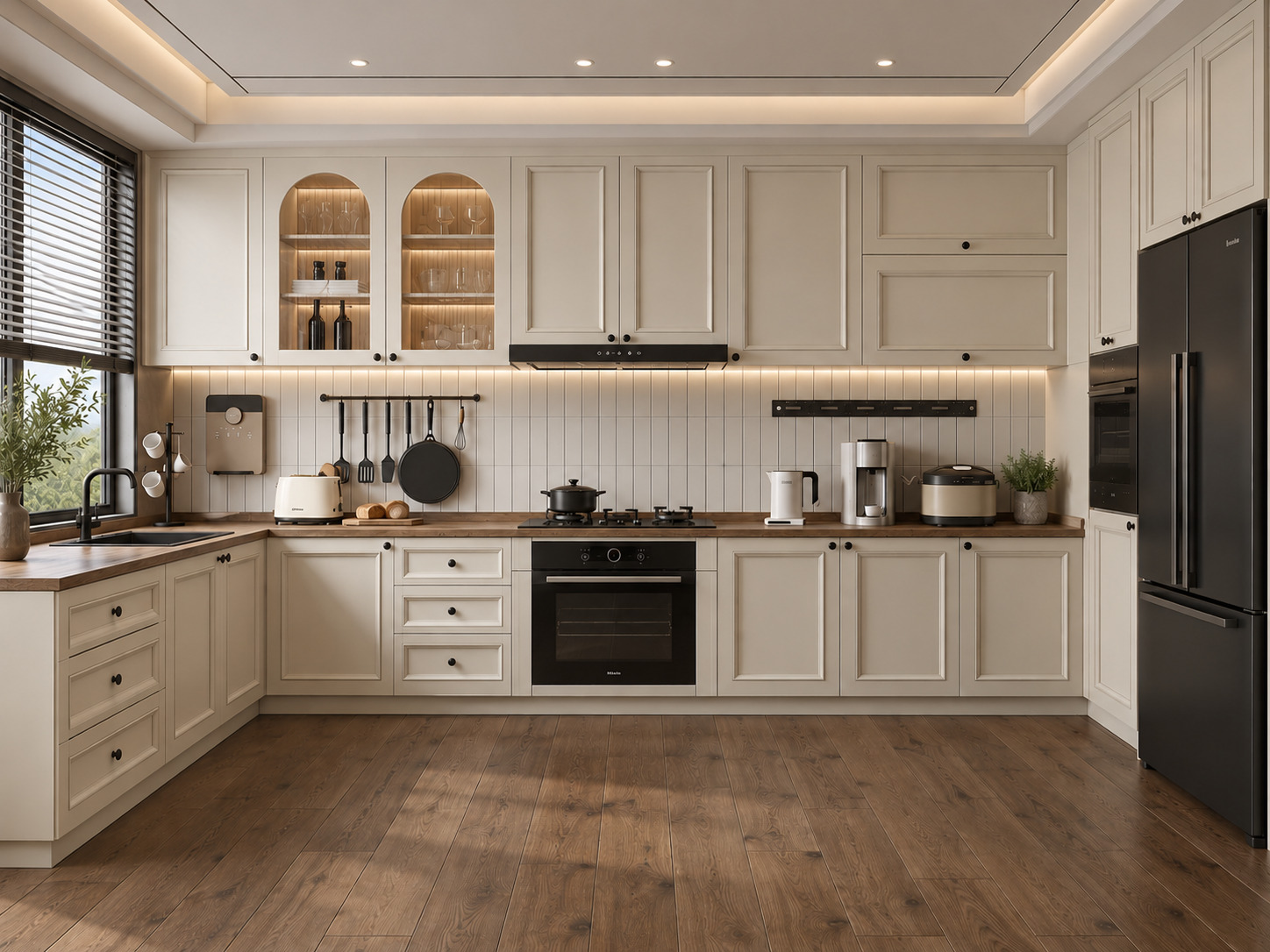
In this project, we brought modern cottage intimacy together with the natural authenticity of warm cream Shaker cabinetry and solid wood countertops. Balanced by internally illuminated arched glass display vitrines, vertical kit-kat finger tiles, and matte black built-in accents, the U-shaped layout infuses the space with a luminous, elegant, and functional serenity through its window-front sink station and tall storage wall configuration.

Neoclassical Kitchen
Arkethane Concept
Neoclassical Kitchen

A Neoclassical Kitchen is a timeless design that combines classical symmetry and framed details with modern materials such as lacquer cabinet fronts and porcelain countertops. It balances aesthetic elegance with technical durability, creating a kitchen atmosphere that is strong both visually and functionally.

Lacquer Kitchen Design
Arkethane Concept
Lacquer Kitchen Design

This lacquer kitchen design combines MDF laminate cabinets cabinet finishes with durable porcelain countertops to create a modern, elegant, and highly functional kitchen space. The seamless integration of built-in appliances and smooth lacquer surfaces enhances spatial clarity, while offering a minimalist, hygienic, and visually refined environment tailored for contemporary residential living.